
According to at least one study, keywords relating to university degrees have the 8th highest CPC with a top CPC of over $40. With that in mind, I started poking around the landing pages for higher education and realized that there are some serious opportunities to improve conversion rates that apply not only to higher education, but to other industries as well.
But why are landing pages so important? Ideally through the creation of a custom landing pages for each and everyone of your campaigns you are able to control the user’s journey and maintain continuity from ad copy all the way to conversion. In an environment where even the smallest changes in percentages matter, terrific landing pages make all the difference.
I have done an analysis of several landing pages that are used to generate leads for secondary education institutions. To allow for equal analysis, I have created a scoring model taking into consideration:
- Headline
- Imagery
- Call to Action
- Linking
- Story Telling
- Value Proposition
- Overall Score
All of these factors influence the overall score for the landing page, which is an average of all of their individual scores, evaluated on a 1-10 scale. Check out what makes these landing pages good, where they fall short, and learn from their mistakes.
Berkeley
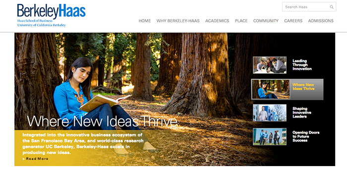
- Headline: 4/10
They are not following a typical landing page format with one consistent headline — instead, they are using sliders to convey multiple messages. Singularity in their messaging would likely improve conversions.
- Imagery: 4/10
Berkeley is using photos that flirt between stock and unique. While they are not ideal, they are scholarly and somewhat to be expected. I’d argue that if they were to leverage attention driven design these images could serve a greater purpose.
- Call to Action: 2/10
What call to action (CTA)? Above the fold, the copy for their CTA is to “Read More.” Instead, copy like “Start Your Future Today” might convert better. Below the fold, they do have a form in the sidebar, but it’s definitely not the ideal layout.
- Linking: 1/10
There are over 119 links on this one page…holy cow. Ideally, we want to have only one link and that’s to the confirmation page.
- Storytelling: 5/10
With their videos and copy, they do a good job of letting you learn about their programs. Unfortunately, the effort is disjointed. If they were to lead with a video above the fold it might really help convey their value in an engaging format.
- Value Proposition: 6/10
Their value proposition is where they shine. They do a good job of showcasing innovative leaders who have made a difference after attending their program. Once again, a more prominent video would be a better way of highlighting this + a consistent hero image and headline.
- Overall Score: 4/10
While they do a great job leveraging multiple types of content (photo, video, lookbook, copy), they do not organize it in an easily consumable format. They could make massive improvements by simply removing their external links, creating a unique page for each of their ad groups, and utilizing their video.
UCI
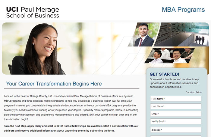
- Headline: 7/10
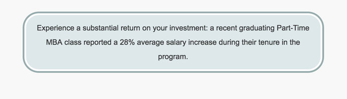
UCI does a good job here on their headline by using singularity. They also do a great job of speaking to their target market. I am curious as to how many people are already in the workforce and going back to school compared to those who are coming straight from undergrad. With that being said, they have a strong persona they are speaking to, but invoking a little more emotion or a unique selling point could be beneficial. Something like: “Execs Graduating Our MBA Programs Experience a 25% Increase in Salary on Average” could be more appealing and worth testing.
- Imagery: 3/10
Stock photos are starting to look like a trend for MBA landing pages. With that being said, there is a large opportunity to showcase a strong photo that depicts their headline: “career transformation.”
An illustration of how this process works and how it can be accomplished would add synergy to their imagery and messaging. Here’s a great outsourced design company.
- Call to Action: 7/10
I love their ALL CAPS call to action at the top of the form and the urgency of their content. But, notice their button CTA: “Submit My Request”. Here are some suggestions that might be better!
- Start My Journey
- I’m Ready to Grow
- Send Me More Information
The simple reminder is this, don’t use the word submit!
- Linking: 9/10
They do a terrific job of keeping most of their content on the page and avoid linking out to other pages on the website. But, they could drastically improve by internally using lightboxes to condense the information for determining which school is best for each student.
- Storytelling: 8/10
By separating their programs into personas, it is easier for potential students to understand what program might be best for them and why. Furthermore, they have a really cool virtual tour feature that allows someone to experience what it’s like to be there.
On the downside, they do not do a great job with their color scheme, font, or imaging to really tie it all together. Here’s a great tool for working on your color schemes! Lastly, while the virtual tour is an amazing feature, it could definitely be tested above the fold and integrated better into the CMS to keep a clean user experience.
- Value Proposition: 9/10
Better than the other competitors, UCI does a great job of highlighting how they compare to other schools and the inherent financial benefit of attending their programs.
I would argue that they could highlight this even better and wrap this into their storytelling by using a picture for their blurb and making it more of a testimonial. Overall, it’s a terrific display of their value.
- Overall Score: 7/10
UCI is doing the right thing by leveraging a custom landing page for their adwords campaigns. With that being said, there are two big wins for them and anyone else who ends up in a similar situation:
- Have a unique campaign, ad group, and landing page for each of their MBA programs. They could do a much better job of selling the value of each program if each had its own keywords, ads, and creative.
- They need to keep the actual conversion on the page. Notice that they do have the form in the sidebar, but at the bottom they have an “apply now” button that takes you to a separate environment that looks more like a login then an application. This should probably be removed.
They have a terrific start and a good example of a landing page with purpose and intentionality.
USC
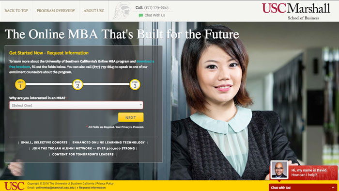
- Headline: 6/10
“The Online MBA That’s Built for the Future.” While that’s enticing, I am not sure a headline should be used to boast, so much as to personally persuade. By adding personalization in the copy they could speak towards the user and definitely something to split test.
For example, a headline like “The Online MBA You’ve Been Looking For” would speak towards the user’s current situation after clicking on a search ad.
- Imagery: 3/10
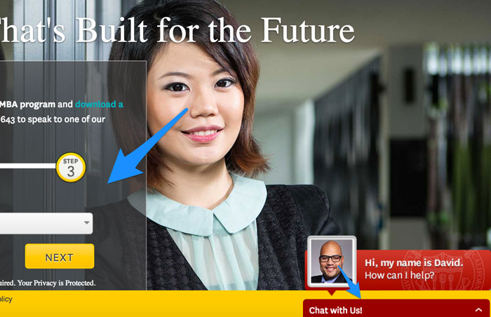
The stock photo, once again, is making its way into the landing page. While stock photos can still be used, it is important to at least leverage them to your advantage with the proper directional cues.
She should be looking towards the next button to help guide your attention to the form. Instead, her and David in the chat bar are looking straight into your soul. The goal with imagery is that it should fit with your overall message. Think about these elements:
- Does the hero shot match my headline?
- Do my photos encourage my desired action with directional cues?
- Are these stock photos??? Go shoot some real ones.
Simple changes make big differences.
- Call to Action: 4/10
The call to action is tough to understand with so much noise on the page. Without the directional cues, my eyes are left to wander and the exact action I am to take is unclear. An arrow would be a great asset to this page, it would allow me to know where to start and guide me in their process.
Obviously, you’d want to work with your design team to tie it all together, but arrows and font size can help you assign hierarchy to the readers consumption process of your page.
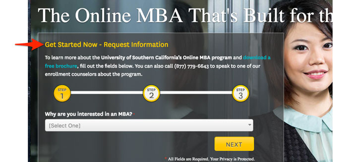
In addition, “Get Started Now – Request Information” is not the most compelling of arguments. Once again, personalization would go along way: “Jumpstart Your Future Today” might fall more kindly on their target market.
- Linking: 10/10
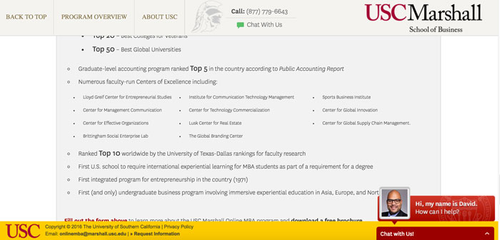
They do a terrific job of using anchor tags and other design features to keep the user not only on the page, but also engaged. From their menu, all anchor tags, to their “Chat With Us” copy in the menu, everything is interlinked and has beautifully written javascript that helps show the visitor what is happening.
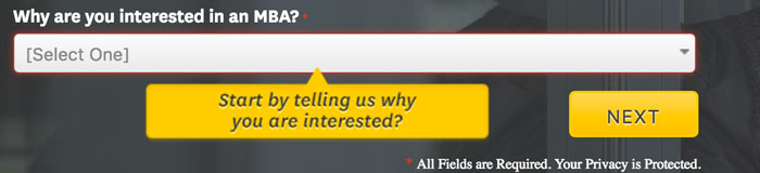
For example, when you click on any CTA button, the dropdown menu of step 1 shows a beautiful blurb saying: “Start by telling us why you are interested?” This is the kind of features and copy that helps a page head towards unicorn status – or, would if they’d left out the question mark.
- Storytelling: 3/10
Unfortunately, despite all their beautiful design features and a well-built page, there is little story being told. The pure focus of the page is to get the user to contact them, but forgets about creating the reason WHY that visitor should.
For example, all their great features (see below) are below the fold. Furthermore, their copy and video is thrown together as an afterthought below the fold. With poor padding and an overwhelming amount of text, it leaves the visitors overwhelmed and potentially feeling not ready. My attention is everywhere and with the headline matching the menu font plus the distracting footer and countless calls to action, I am ready to leave the page rather than stay on it.
A simple solution is to once again use lightboxes or blurbs with the correct padding, to allow the user to digest only the most valuable pieces of the USC story. Instead, the full-width text can be difficult to consume and frustrating to focus on.
- Value Proposition: 6/10
Once again, the moment you scroll it becomes difficult to truly consume and understand why this program will be so instrumental to your future. They try to organize all the facts and show their value, but with small font, different column sizes, and everything not fitting in one screen, I think they’re good, but I am not sure why.
Displaying your value proposition is more than just throwing all of your stats on a page. It is about carefully designing your most valuable stats so that the visitor can understand how those stats and facts pertain to them.
If your user cannot truly understand the WHY of your value proposition they won’t believe it applies to them.
- Overall: 5/10
While their technical development of the page and overall programming of the page was far superior to their competition, the page fell short in design and storytelling. Despite all their great content, the organization and readability of the content fell short of expectations.
There is a crucial learning from this — what happens below the fold is often just as important as what happens above it.
Get Educated to Improve Results
While all of these pages have had countless hours of design and testing poured into them, they all have room for improvement. I would argue that every landing page ever built has room for improvement.
As you go back into your own pages, keep the following in mind:
- Personalize your headlines when applicable
- Don’t copy and paste text from your website. Design it into small impactful bites
- Try to avoid stock photos
- If you do use stock photos leverage where the person is looking as a directional cue to your CTA
- Videos tell powerful stories. Don’t just add them as an afterthought
Have fun and optimize on!