Landing page creation has become very anatomical. All the biggest players like Unbounce, LeadPages, KISSmetrics and more have broken down landing page creation to its most vital elements. We’ve pulled together some of the best formulas out there to help you learn the different ways to create landing pages that convert.
What often isn’t mentioned is that je-ne-sais-quoi, or authenticity on a landing page. Following a formula too closely often results in pages with lots of buzzwords, lots of stock images, and elements that may appear convincing at first glance, but don’t hold much weight when scrutinized.
To help you make a landing page that will convert customers and authentically represent your brand and its unique values, we’ve outlined both the basic elements of a quality landing page and ways to go beyond the formula to better connect with your audience.
Anatomy of a Landing Page, according to the greats
Unbounce offered a detailed look at the five key elements of a functional landing page, which include:
- Your Unique Selling Proposition
- The hero shot (images/video showing context of use)
- The benefits of your offering
- Social proof (I’ll have what she’s having)
- A single conversion goal – your Call-To-Action (CTA)
In a nutshell, they believe you need to clearly present your goal, both with content and with what Unbounce calls a hero shot, and you need to build trust between your brand and the audience with social proof.
Leadpages, another popular landing page solution, created the 10 commandments of landing page creation, listing them as follows:
1) Thou Shalt Not Clutter
2) Thou Shalt Have A Clear Call to Action
3) Thou Shalt Not Ask Too Much
4) Thou Shalt Think Like The Customer
5) Thou Shalt Not Sit Idly By
6) Thou Shalt Two-Step Opt-In
7) Thou Shalt Not Cheat
8) Thou Shalt Design for Direction
9) Thou Shalt Maketh Accessible For All
10) Thou Shalt Test
The biggest takeaway from their post would be around testing — constantly monitoring and updating landing pages to improve performance, and getting into the mindset of the customer to create a more satisfying experience, that directs the customer where you want them to without asking too much of them.
Kissmetrics created an easy to remember acronym to help create a landing page that converts well, which they have aptly named C.O.N.V.E.R.T.S:
C = Clear Call to Action
O = Offer
N = Narrow Focus
V = VIA: Very Important Attributes
E = Effective Headline
R = Resolution-Savvy Layout
T = Tidy Visuals
S = Social Proof
Again, simplicity is key for KISSmetrics. Your brand needs to find a way to effectively convey what you do by highlighting your key attributes and using proof of your past success, in a clear easy to digest format.
Lastly, Neil Patel of Crazy Egg released his list of 12 essentials for creating a convincing landing page:
- Headline
- Subheading
- Pictures
- Explanation
- Value prop
- Logical flow
- Something about pain
- Something about pleasure
- Trustworthy testimonials
- Method of contact
- Guarantee
- Powerful CTA
His list is most interesting because it focuses on bringing up the customer’s pain points, and then introducing them to the ways you solve for those issues. His inclusion of a guarantee is also an interesting way to possibly increase conversions.
Putting their advice to work
All of the formulas have several elements in common:
- You need to have a catchy headline that answers the customer’s question and shows them what you can offer.
- You need to present your business’ value prop, with supporting images, to quickly convince the audience you have what they want.
- You need a clear call to action, so the customer can move towards getting what they want (and you need to actually follow through on that promise once they click your CTA).
- You need some way to convince them that pressing the CTA button is a good idea, either with social proof or with a guarantee
Now that you know the basics, the next step is giving it a shot, and building a landing page that fits your brand’s offering.
Mistakes to Avoid
In the case of custom logo design, I looked at the top results in AdWords to see how well those landing pages followed the landing page formulas, and to see which company convinced me.
Option 1: Too Much Template
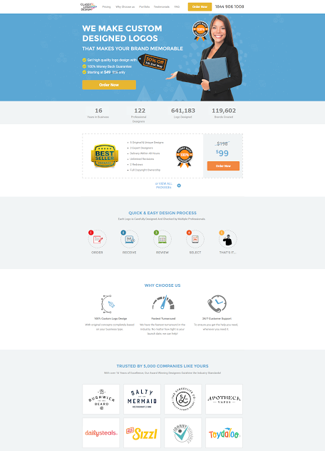
The first result was from Classy Logo Design, and the very first thought I had was, “I’ve seen this before.”
Using a template is fine, so is using stock photos (even though I’ve seen and used this particular model in too many pieces of content to count), but if a design company is bidding for the keyword “custom” I don’t expect to see something so generic.
The thing is, this company followed all of the steps. What they do is clear. It may not be the most exciting headline ever written, especially because it’s more about what they do than what I want, but at least it’s clear and it’s relevant to what I was searching for.
They also have all the bells and whistles that help convince me of their competence and effectiveness, but something is off.
The girl’s body language is positioned towards the call to action, there are guarantees and slashed prices and trust seals and testimonials and examples of their work, but it doesn’t have the authenticity needed to convince me.
If you claim to create custom logos to make my brand memorable, why is your landing page so bland?
Option 2: Missing Info
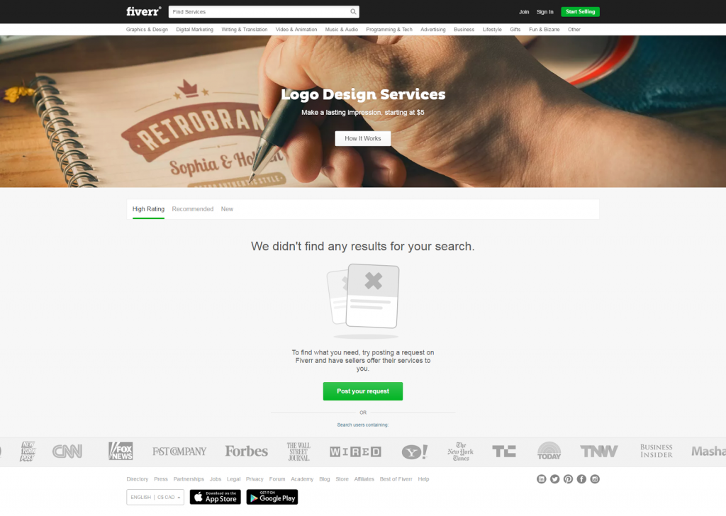
The next option is Fiverr, a marketplace offering a variety of tasks and services starting at $5.00. I’ve used Fiverr before, and for small businesses this is a great option, but the landing page absolutely failed.
When I see a faded grey X on my screen, I leave, before reading anything else. This automatically generated landing page directs people to a place where there is nothing to see.
The headline and subheading are fine, “Make a lasting impression starting at 5$” is catchy, but because there’s nothing on this page, not only has Fiverr lost my business, they’ve also negatively impacted the way I see their brand, and may dissuade me from using them for other projects. If they had followed the steps to create an effective landing page, they wouldn’t have let this slide.
Even if Fiverr does more than just custom logo design, their landing page shouldn’t remind me of that. If you’re going to pay to advertise for certain keywords, make sure you don’t waste your money with pages that aren’t relevant.
It is so important to ensure all your pages are relevant to the keywords you’re bidding for. The call to action on this page is “How it Works,” but I don’t want to learn how Fiverr works, I want a custom logo and I want information about it on the first page I land on, not the next. Advertising across too many keywords or variations may end up costing your business more than it’s worth if you don’t take the time to follow at least the four common elements of landing page design.
Option 3: Homepage with Confusing Copy
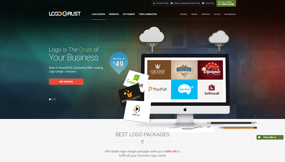
The next landing page I came across was for a company called Logo Crust.
Technically, this isn’t even a landing page, it’s the company’s homepage, which is a big no no for several reasons.
First, all the landing page formulas focused on creating something simple, that clearly guides your audience where they need to go. A homepage has too many links to click and actions to complete. Plus, it talks more about the company than the user, and as LeadPages wrote in their ten commandments, you need to put yourself in the customer’s shoes to satisfy them.
Second, as a potential customer I was confused and overwhelmed. Right away someone sent me a chat message, and before I knew much about the company I was looking at the pricing.
Most confusing of all was the copy. What does, “Logo is the crust of your business,” even mean? When I think of crust I imagine the bit of bread left on my place after I eat all the best parts of a sandwich. It doesn’t really sound like something I want my logo to be.
Rather than spend the time building a landing page to sell their services in a simple and effective way, they took the lazy route and directed me to their homepage, which didn’t effectively convince me because there was too much going on.
Option 4: All the basics
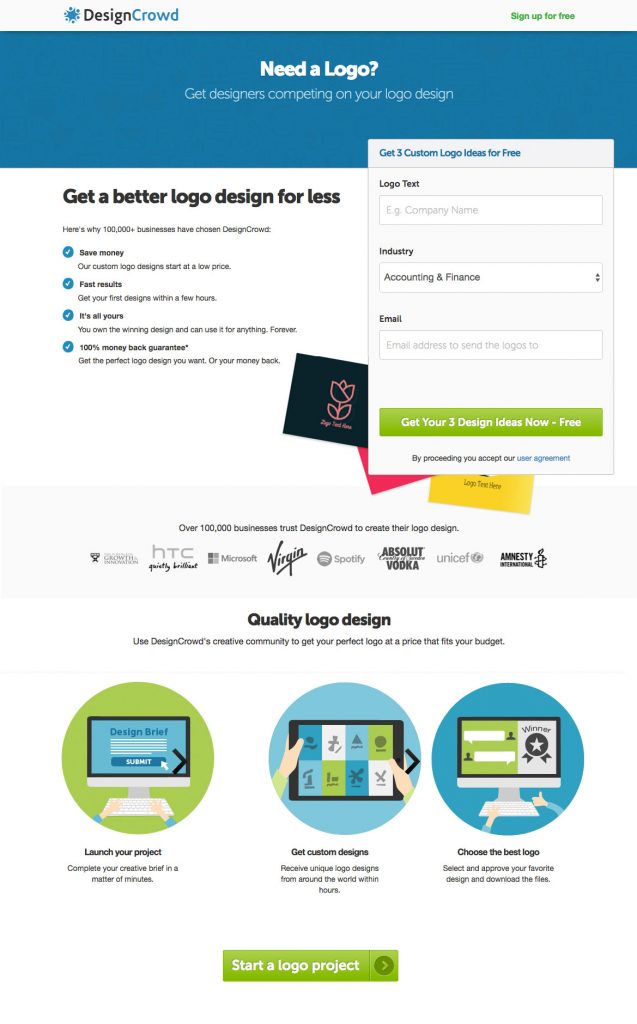
The last option was from Design Crowd, a marketplace that crowdsources design. Like Fiverr, they offer many different services, but their landing page focuses clearly on delivering a solid logo to the customer.
This landing page isn’t perfect; there’s no social proof and there are only a few short sentences to convince me of the benefits of their offering, but I was intrigued by the copy and the company’s unique value proposition.
First, I’m attracted by their question. I do need a logo. Next, I love the idea of having multiple designers compete for my business. And lastly, I’m liking that it’s free.
More logos or design on the page would be nice, but they’ve gotten my attention enough for me to fill out the form and move to the next stage of the conversion, and that’s really what landing pages are all about. Once you’ve got the lead, you can start using your email marketing to turn them into a bona fide customer.
Too long, didn’t read
Ultimately, it’s not about blindly following rules. Creating a well converting landing page is about presenting a sentiment that your audience will connect with. You have one page to build up enough trust to collect personal information from someone who in most cases has had no interaction with your brand before.
Follow the steps shared by Unbounce, Leadpages, KISSmetrics and Crazyegg, but as you do, always keep in mind the user’s expectations and desires to create an authentic page so audiences will feel confident doing business with you.


